Despite that old adage, we all judge a book by its cover. Publishers in particular know that cover design is crucial to marketing and can influence sales if done right. Sometimes a particular cover can act as a shorthand to the contents within (pastel colours and cutesy illustration for romance; dark and earthy tones and big fonts for crime fiction).
The shortlist for the Australian book design awards 2023 has recently been announced, showcasing some innovative and interesting cover artwork, designed not only as an exemplar of beauty but, critically, to also pique potential readers’ attention. In fact, so influential can covers be, that the Stella Prize judges had to read submitted entries on e-devices, lest they be unfairly swayed by the aesthetic appeal (or lack thereof) of the books in contention.
ArtsHub asked a number of authors about the process and creation of their own book covers; the idea for the cover design was frequently led by authors themselves.
Emilie Collyer’s debut collection of poetry, Have You Got Anything Less Domestic? was recently published by Vagabond, with the poet very involved in the cover design. ‘I had the idea to use an image that already featured, in a way, in the book. I had written three ekphrastic poems in response to photographs by Daisy Noyes, part of an extraordinary collection she made called Mother Figure: 71 Self-Portraits in Isolation. I kept circling back to one of them, titled Burning Bush.
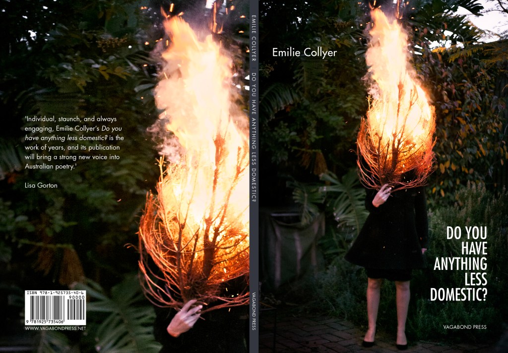
‘I thought it would be lovely to have this photograph on the cover, given I had written a poem in response to it and also that I know Daisy. I loved the idea that my book could feature work by a local artist and someone I had a creative relationship with.’
After permission was sought from the artist, the image was duly used. Collyer tells ArtsHub that it very much reflects her book’s content. ‘The book is about a sense of moving through the world with a feminine and feminist sensibility. It contains both personal and domestic poetry, and also poetry that responds to artworks, to politics, to pop culture. This image captures those dynamics and resonances so beautifully. It is domestic and ordinary (a woman standing in a backyard) and is also wild, fantastic and extraordinary (she holds a burning bush). It is such a stunning image that speaks to the body, to personal circumstance, and to creative agency.’
Fellow poet Willo Drummond whose debut collection, Moon Wrasse, was published by Puncher & Wattmann agrees with Collyer insofar as ‘the cover is absolutely essential to the whole concept, thematics and tone of the book’.
Drummond adds, ‘A moon wrasse (Thalassoma lunare) is a species of fish that transitions from female to male in mid-life. There are two moon wrasses on the cover of my collection and, in addition to the theme of transformation, they speak to the ideas of intersubjectivity and dialogue that run throughout the work.’
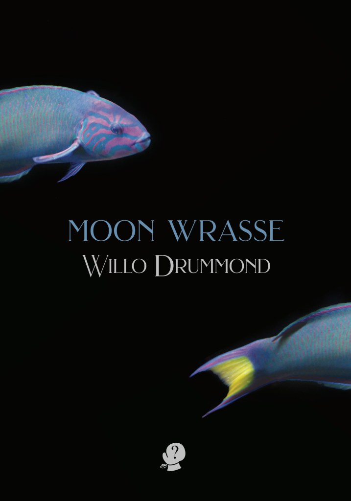
Drummond went through many iterations with designer Miranda Douglas. ‘As a debut author, with not much sense of how things worked, it was challenging (and sometimes anxiety inducing) to remain assertive and keep pushing for what I wanted. I was also conscious of how lucky I was to have the level of input I was being offered. The process contained some surprises as I was often presented with a choice (for example, font, colour etc) and chose differently than I’d anticipated,’ she says. ‘In the end, I was thrilled with the outcome.’
The cover of Sian Prior’s memoir Childless, was also relatively easy to put together. ‘I sent my publisher a bunch of images that I thought reflected something about the content, and designer WH Chong created a cover that incorporated elements of those ideas. I was offered a couple of options with minor differences (on how the text was presented) and they went with my preferred choice.’

The illustration, Prior continues, was ‘perfect, the bittersweet combination of joy and longing and my passionate love of the ocean’. When asked whether she’d like to change anything about the cover once it was published, Prior says, ‘No, I’d rather change some things about the contents to make it match the cover even more closely!’
About the actual artefact of her book, Dingo Bold, which is about the relationship between humans and dingos, Rowena Lennox says, ‘I would change the typeface for the back cover blurb. It’s a sans serif typeface, white on black, and I think it gets lost. I would change the paper the book is printed on if I could, but I’m happy with the front cover and the spine.’
Lennox, who has also worked in-house and freelance as a book editor, has seen both sides of publishing – as producer and as author. ‘It’s such an emotional thing,’ she says. ‘I think it’s because every time you look at the book, you see the cover. There’s no escaping it!’

Fortunately, Lennox’s experiences were without undue drama. ‘I gave the publisher examples of covers that I liked and a photo I wanted to use. They gave me a few roughs based on the examples, and we had a bit of to and fro, fine-tuning the type and the background. There were two designers involved (someone interning at the publishing house, who did the initial concepts as well as their usual designer, who came in later).’
For Kirsty Everett, however, the cover of her first book Honey Blood in 2021 was tricky to negotiate because of the subject matter.
‘Cancer, for many people, is their worst fear and my book is about how I survived cancer twice before the age of 21, so the creation of the cover wasn’t a quick and easy process. Memoirs, autobiographies or biographies often have a photo of the individual on the front of the book, [so I] provided HarperCollins with all sorts of photos of me.
‘We had images of me before cancer as a gymnast, then bald and sick photos of me. Then, photos of me in remission between the ages of 12 and 16. Then, more bald and sick photos of me when I had cancer for the second time, and I was told I had a 17% chance of survival. Then, of course, we had photos of me being healthy once again in my early twenties and some present day photos of me, but none of them felt right.
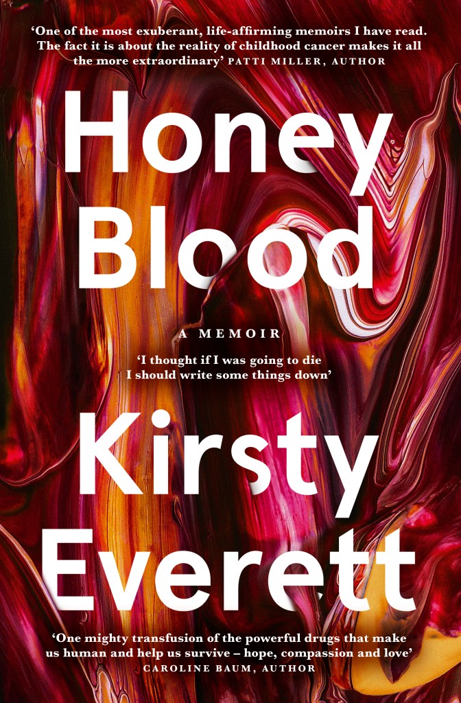
‘The word “blood” in the title meant that some cover options with an image of me on the front gave the impression the book was perhaps about the bloody demise of a young girl.’ So, instead of using an image, Everett’s designer Amy Daoud decided to create an abstract cover, with the author fully endorsing this decision.
‘The thick, liquid-like paint is a perfect reflection of some of the crucial descriptions inside the book. If we’d put a photo of bald and sick me on the front cover of the book, I feel it would’ve scared people away. Cancer is extremely scary, but sharing real stories about living through cancer as a First Nations child and teenager have been perfectly reflected in Amy’s artwork for the cover of Honey Blood.‘
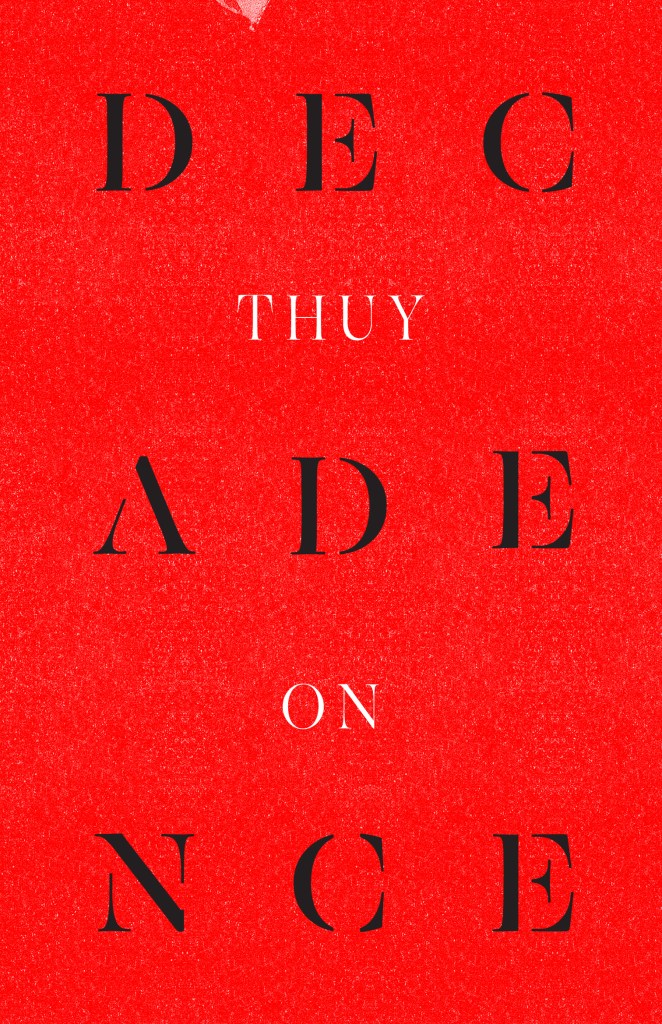
For my own book, a second collection of poetry, I was adamant that the cover eschewed any illustration or graphics. The design brief for my publisher UWAP was for typography only on a red background and hence the text of Decadence is broken up in three bits, to reflect the three sections in the book (‘Meta’, ‘Physical’, ‘Spaces’) and also to emphasise the focus on the wordplay and the building blocks of language that feature within.
Sometimes, it’s worth asking those outside the publishing and design industry for advice. For Anna Featherstone’s latest book, a non-fiction guide about self-publishing, Look – It’s Your Book!’, she took three early cover design drafts from a professional book cover designer, Tess McCabe, to her local bookstore and the library for their input. ‘Doing this kind of polling is a great way for publishers/authors to not only build awareness of an upcoming title, but also to get input from the experts,’ she says.
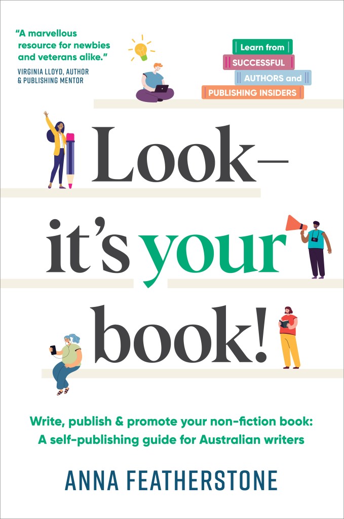
‘The chief librarian also said at the time: “An acquisitions librarian always judges a book by its cover”,’ Featherstone says. ‘Unanimously they chose the cover design I had relegated to last position! So glad I reached out for and acted on the feedback.’


