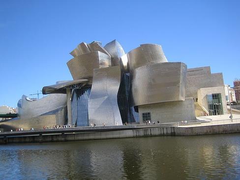
Frank Gehry’s Guggenheim Museum in Bilbao, Spain
Museum architects have become “Starchitects” – global celebrities beyond the architectural community, producing iconic buildings transforming cities as destination venues.
The phenomenon really started in 1977 with the opening of Centre Pompidou designed by architectural team: Italian icon Renzo Piano, Brit Richard Rogers and fellow Italian Gianfranco Franchini. This so called ‘deconstructionist architecture’ with its industrial aesthetic was as much about urban grittiness as it was engineering efficiency and spectacular – and it changed the way we approached the museum.
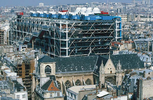
Centre Pompidou
But it is most typified by Frank Gehry’s Guggenheim Museum in Bilbao, Spain which opened in 1997.Known as the “Bilbao Effect” or “Bilbao Factor”, it is thought these buildings not only become landmarks but have injected financial growth and prestige into cities, re-inventing them through culture.
With the explosion of the architecture spectacular that followed Gehry’s Guggenheim, the question circulating was, at what cost to their function as receptacles of art?
This was a topic fleshed out at a recent symposium, Inside Out: The Dynamics of New Museum Architecture on Display at Sydney’s College of Fine Arts presented by the research group in.site.
Gay McDonald, of in.site UNSW, set the tone for the symposium: This extreme makeover of the late 1990s was a ‘response to a new set of cultural and economic conditions in an era of rising costs, tightening of corporate and government funding, where art museums are under intense pressure to revamp revenue streams or generate new sources of funding with competition fierce by the leisure industry.’
Symposium panelist Richard Francis-Jones, of Francis-Jones Morehen Thorpe (FJMT) and architect for the Auckland Art Gallery Toi o Tamaki which received World Building of the Year 2013, said: ‘Architecture has in many ways been reduced to a consumer object and has been given the status and value of a brand through the intense promotional activities of its authors.’
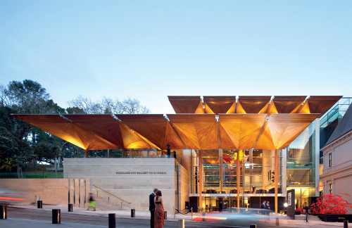
Auckland Art Gallery Toi o Tamaki
He continued, ‘The art museum has become a new cathedral of our cities and perhaps in many way defines the status of city as the cathedral used to. We have focused on the creative energy and talent of our greatest architects into making these monumental artifices for art in view, it seems, with almost mythic contemporary significance.’
Setting up this idea of spectacular or receptacle, McDonald pushed the notion, ‘While we may not find all the exhibition spaces conducive to the display of art, in one audacious move Gehry’s design for the Guggenheim bought about a radical shift in global art museum design and its ability to magnetize audiences.’
The boxes to check these days are vast: a building has not only to be functional, but expand the visitor experience, be culturally significant to a place and a magnet for visitors drawing the tourist dollar. How are architects accommodating the changing needs of museums? At the heart of this equation is a complex balance of architecture, interior and exhibition design, and as architectural critics globally will attest, many are getting it wrong, as well as right.
Keynote speaker for the symposium, Director of London’s Hayward Gallery Ralph Rugoff made a case for the gallery as receptacle not spectacle showing that an ugly duckling but a classic box, fraught with problems of access and age, can sustain itself as one of the world’s leading art museums through its ability to consistently transform the viewing experience.
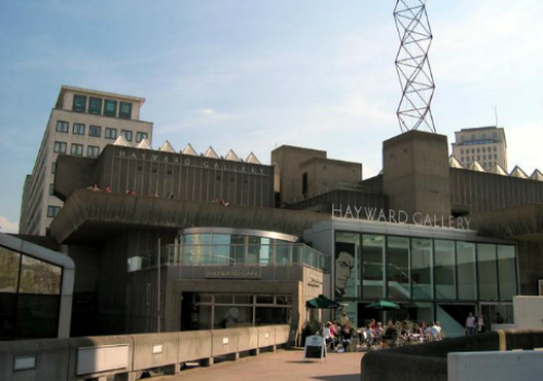
Hayward Gallery
Rugoff started with the simple but often forgotten statement: ‘As a curator, I am constantly learning and relearning that I can’t take the presentation of art for granted, that design and installation can really make or break a show.’
He said good exhibition design was about responding to surroundings. ‘Good exhibition design begins with getting a sense of art’s extreme sensitivities to its surroundings and you confront this every time you install an exhibition. What might look great on paper has to be rethought when you start to install. If you see a travelling exhibition at different venues it makes this really clear.’
It was a point of flexibility shared by Sam Marshall of Architect Marshall, the architects responsible for the $53m extension to Sydney’s Museum of Contemporary Art, as well as Object Gallery, Darren Knight Gallery, and Campbelltown Arts Centre. Marshall said, ‘White box, white cube, whatever you want to call it, it is usually the starting point and most often the end point.’
He added, ‘I strongly believe the architecture shouldn’t compete with the art in the galleries. Stripped down, simplicity is the desired end result. Every gallery we have done responds to the different set of circumstances and the results are always individual.’
Rugoff said, ‘For me as an exhibition maker, the most important thing I want from architecture is not a spectacular exterior or materials inside, but its adaptability. I don’t want architecture to find a solution. I want it to provide the opportunity to come up with solutions.’
Designed in the 1960s and based on the then recent development of the television studio, the robust volumetric spaces of the Hayward allow for maximum flexibility and, paired with Rugoff’s curatorial genius, are regularly radically reconfigured. Rugoff said, ‘The Hayward never looks the same from one show to the next. It makes people immediately pause and start to think in a fresh way.’
Susan Freeman, co-director of Freeman Ryan Designs specialising in exhibition design, said, ‘We always work from the artwork first and then develop the content around that. In a good exhibition you can’t see the exhibition design. (As exhibition designers) we are negotiating between the artwork and the visitors. It makes it a very different design role from architecture and interior design – it has to disappear.’
But Francis-Jones made a case that the neutral environment is never really neutral. ‘In any event, does the neutral white box really allow the work to be independent of interference or does it maybe sanitize and sterilize it, removing it from time and context and alienating us from it in a kind of rarified form?’
Rugoff raised a similar point in regard to exhibition design: ‘Visible quotation marks quarantine it or restrict how we read or respond to it. Conventional styles of display can give an institutional kiss of death to an artwork by over exposing an object and transforming it into a kind of holy relic.
‘One of the key things exhibition design should do is to create an experience of active uncertainty, not doubt, but to embrace a willingness of not being sure and one way we can do this is to disorientate us to a certain degree but without leaving us so much that we don’t know how to proceed.’
Rugoff cited several exhibitions he had worked on where the environment used the architecture. A work that demonstrated his point to outstanding effect was Teresa Margolles’ Aire/ Air 2003, part of Hayward Gallery’s exhibition Invisible: Art of the Unseen – an exhibition that used the gallery’s architecture to reveal interventions and artworks otherwise unseen.
Viewers entered an empty room that was noticeably humid; gradually noticing the walls were also moist. Upon reading a label they learnt that the cause was a recycling of the purified water that had been used in a morgue to wash corpses.
Rugoff demonstrates that the viewer can ‘no longer disappear in the white cube and is no longer confined to traditional ways of viewing. Instead, the audience is performative, the body implicit in the exhibition. Public and private behavior is blurred as new ways of exploration.’
While this example takes the extremely introspective or micro view of architecture as receptacle, Rugoff perhaps better sums up the challenges of the day when he addressed the entry to a gallery space on a macro level.
Rugoff said, ‘Museums tend to welcome us with a big impressive statement foyer or lobby areas. What we need more is a type of space to help us change mental gears, not overwhelm us, but to provide a transitional moment where we can slow down and recalibrate our focus and attention span and clear our minds before entering an exhibition.’
McDonald said, ‘It is now commonplace for large scale art museum to offer a host of amenities that were unimaginable fifty years ago, and while the art may be the main focus of the institutions, the museum experience is complimented by an increasingly cosmopolitan and commercial array of lifestyle services, such as cafes, bars, comfortable places to relax in, bookshops and gift stores, film centers, and baby minding facilities.’
What was defined as the first principal by the Modern movement may be considered a limited one in today’s context – that function is more complex than simply defined by pragmatic use.
For all the architects and designers across this symposium, their experience was well documented through examples of projects, as well as peppered with museum designs they felt successful. Among the examples Freeman cited were:
Caixa Forum Madrid designed by architects Herzog de Meuron and completed about two years ago. They sliced and removed a component of the building to provide an, so you have the experience of the building hovering.
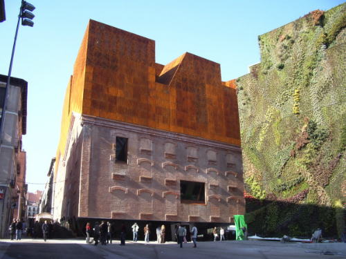
Caixa Forum Madrid
Dia Art Foundation’s museum on the banks of the Hudson River in New York – and like MONA it is a space worth traveling to. Occupying a form box-printing factory it was transformed by architects Alan Koch, Lyn Rice, Galia Solomonoff and Linda Taalman of then OpenOffice, with the artist Robert Irwin, as well as Donald Judd and Dan Flavin.
![]()
Dea:Beacon
Freeman explained, ‘The hand of the architect is not particularly visible which is very refreshing; the hand of the artist is very strong in the manipulating of the space.’ She added, ‘Unlike most spaces there is no particular path of travel.’
Freeman also cited Teshima Art Museum in Japan, designed by Architect SANAA with project team Ryue Nishizawa and Kazuyo Seijima, and importantly in this example structural engineer Mutsuro Sasaki.
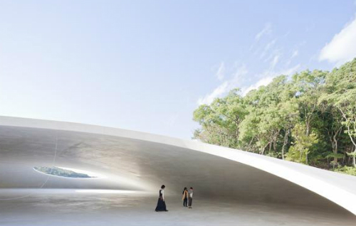
Teshima Art Museum
A series of purpose built house museums on Naoshima, a small island near Okayama in western Japan, including the maze-like Lee-Ufan Museum (opened in June 2010) and the Chichu Art Museum, which opened in 2004 have been described as a confluence of art and architecture “to demonstrate the ideals of living well”. The architect for the entire project is Tadao Ando, who is credited with the same status as the artists. Both are constructed largely underground integrated into the landscape, not unlike the objective of Tasmania’s successful MONA.
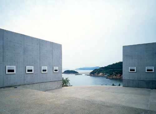
Naoshima Chichu Art Museum
Freeman said, ‘Little of the building is visible from the outside but none the less you would have to say it is a spectacle building.’ She added, ‘I really think that in the end the spectacle / receptacle argument has to fall out of the brief, the location, the building type and particularly the collection, and if the hand of the designer is particular light then there is a chance.’
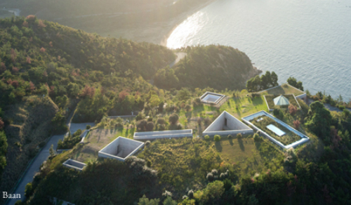
Naoshima Chichu Art Museum
