Do you read the wall labels when viewing an art exhibition? Do you like a lot of information to draw out connections and ideas, or are you more of a ‘let the artwork talk to me’ kind of gallery-goer?
ArtsHub caught up with a number of museum professionals to ask what the trends are today, and what they have found to be the most successful formula.
Highbrow/lowbrow: what makes a good wall label?
Miranda Wallace, Senior Curator of International Exhibition Projects at the National Gallery of Victoria (NGV, Melbourne), says the Gallery has made the recent decision to pull back the length of its wall labels from, typically, 200 words – with lots of arts jargon – to around 100 words, which she describes as ‘a more friendly version’.
‘Labels have to have a balance between audiences new to the subject, but also to not treat them as the only source of information. We often have a micro site for an exhibition and an audio guide, so there are those layers,’ continues Wallace, who admits that she herself ‘reads everything!’
Deputy Director of the Chau Chak Wing Museum (CCWM, Sydney) Dr Paul Donnelly says that CCWM definitely has maximum lengths for all labels, adding that humour can also help engage visitors.
‘Curators are experts who often live their collections and have lots to share. My mantra, though, is that if visitors want to read a book they would rather sit down! It is also important to note that maximum is just that – there is no minimum!’ he tells ArtsHub.
Donnelly says, ‘Writing labels is one of the most enjoyable but difficult parts of being a curator. Distilling the important elements into the most critical and accessible information, while being engaging (even humorous!) and within the word limit, takes practice. There is no tip, but you know when you’ve got it right, and people are happy to let you know when you haven’t! A good editor always makes the difference.’
Like Wallace and Donnelly, Director of Ngununggula, a gallery in regional Australia, Megan Monte believes that wall labels should be short. She says, ‘There needs to be room for people reading the wall labels to interpret what they are looking at themselves, but it is also important to provide an introduction, or a suggestion, to what they are looking at.’ The Gallery typically likes to ‘thread the artists’ voices through those statements and extended labels’.
Monte continues: ‘People tend to zip through gallery spaces; they are there only a short amount of time, so while we choose shorter labels, if there is an opportunity for further information, that is always good – we like to use QR [quick response] codes.’
Guy Richards Smit captured the conversation in his cartoon for Artnet News (November 2022), ‘Can art still be good if it only makes sense after you read the wall text?’

Digital labels and QR codes
Thea-Mai Baumann, Director 4A Contemporary Asian Australian Centre in Sydney, believes that wall labels need to be shareable. ‘There needs to be something within the label that encourages sharing of the idea, in whatever form it takes, whether it’s a GIF, a QR code or snippet of text. I think the mounted didactic panel/text thing might have seen its day.’
Baumann continues that she is also in favour of QR codes. ‘It’s because I’ve done a lot of China time and, for everyone there, it’s not a barrier. WeChat is massive. Everyone shares contacts through the QR code. It’s [as if it is] embedded in the mindset of communications. So, yes, I am a QR code fan. I think there are just some barriers, that there are some mental blocks that people need to move through.’
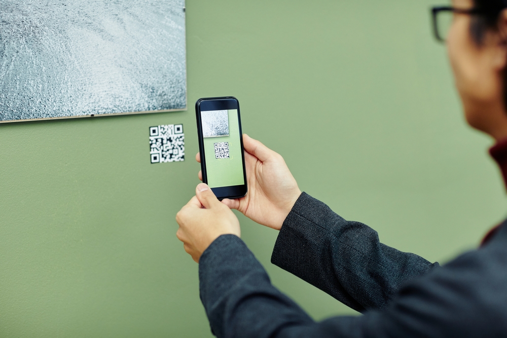
Monte agrees: ‘The use of QR codes is fantastic; they are a really excellent way to get people engaged and participate more in the exhibition due to the interactive nature of them, but it also means that people can download an essay to take away and read later.’
Frequency, design and sustainability
Wallace says that when curating the NGV’s Monet exhibition, Monet’s Garden: The Musée Marmottan Monet, Paris (2013), her colleagues abroad said their rule of thumb was one in three artworks gets a label. ‘We do two in three, so about 70% of the works. Australian audiences read a lot more than in North America.’
Wallace says the NGV’s didactic panels introducing an exhibition or wall themes are around 250 words, adding the Gallery has also changed the design of its labels. ‘They used to be really small, in rooms that were generally darker; today we are going for a bigger point size.’
Opening last weekend (Friday 10 March) at the National Portrait Gallery in Canberra, Portrait23: Identity has made a feature of its wall labels, presented at scale and as a graphic element in the exhibition’s design.
Sandra Bruce, Director of Exhibitions and Collections at National Portrait Gallery, says, ‘We wanted to make sure we have a lot of fun with exhibition design, and with Portrait23 we have used colour and scale for the didactics to offer another layer, alongside a traditional label.’
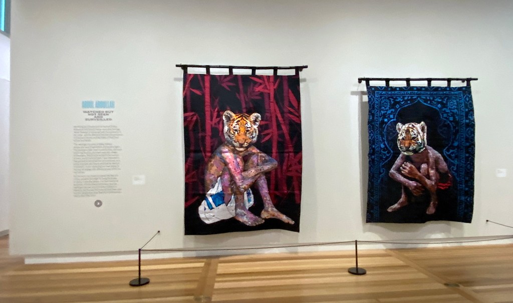
Bruce says the reasoning behind this extra layer is an acknowledgement that ‘the font size on the traditional label sits within the international guideline for accessibility, but might still be a little problematic’.
‘So we offer a range of access points. We have the written word on the wall alongside the artwork, large print label books people can carry around with them, we have an app that people can access via a QR code and we will also have audio descriptions. We are just embracing the many different ways to engage our audiences.’
Making a move away from using large-scale vinyl wall labels, Ngununggula’s Monte says that Gallery has taken a more sustainable pathway. ‘We have never done Corflute or foam core labels, usually due to time constraints. And when we tried sticky vinyl labels, it was expensive and they fell off, so we have turned to using magnets. It is so easy and it doesn’t cost anything and you can adjust the labels if you need to. We Blu Tack bits of metal to the wall, and then use the magnets to hold the wall label in place. It was born out of not being able to print up labels in time, and we had the magnets left over from a workshop.’
Need for diverse voices in wall labels
Speaking from Chau Chak, which is sited within a university environment, Donnelly says, ‘Museums have moved on from the comfort of believing we are neutral spaces – there will always be a perspective and inevitably some exhibitions are more politicised and polarising than others. Importantly, the philosophical shift of museums recognising we are custodians of collections, rather than owners, has contributed to acknowledging multiple perspectives and promoting different voices or “truths”.’
He says that at CCWM they take that responsibility very seriously. ‘The CCWM’s Ambassadors display of Indigenous collections spans eight cases across the four floors of the Museum and are interpreted in the voice of each community the cases represent.’ He also speaks of consultation with Yolngu elders and dual language labels for the important exhibition showcasing those works.
‘Their voices were given primacy through larger font in red text and the large thematic banners inserted direct quotes that appropriately dominated the exhibition space. Labels throughout the Museum give Indigenous nouns when known, and the China Gallery has labels in both English and Mandarin. An exhibition in planning focusing on Orientalism will feature translations in Arabic and community involvement,’ he adds.
It is a position echoed by Museums Victoria’s Dr Michelle Stevenson: ‘Recently Museums Victoria co-curated an exhibition Open Horizons: Ancient Greek Journeys and Connection with the National Archaeology Museum in Athens and we really wanted to reach a local Greek audience, so all the theme labels and quotes were in English and Greek.’
She continues: ‘Generally, the curator writes the labels for internally developed exhibitions, but we also sometimes co-write with [a] community, or will work with external writers or creatives in specific circumstances. At the Immigration Museum many of our newer exhibitions have used a lot of first-person voice, so the curator will only write introduction and theme overview labels rather than all the exhibition text. For example, Becoming You features 71 different first-person stories in their own words.’
The Immigration Museum’s Senior Curator, Dr Moya McFadzean, concludes: ‘As one of the key interpretation methods museums use, didactics can play a significant role in the framing of museums as truth tellers.’
What is certain is that storytelling is huge right now in the museums and galleries and pretty much all pathways for best engagement are up for discussion.
The overarching trend, for all the arts professionals ArtsHub spoke with, is to keep that experience fun and easy for visitors. Gone are the days of heady authoritarian voices.
