Many museums and galleries require extensions and refurbishments to bring them up to contemporary standards. So what can local museums and galleries learn from other projects? The Burrell Collection in Scotland is a good example. It reopened in March 2022 following a renewal by John McAslan + Partners, a global design practice working with organisations including the British Museum and London’s Natural History Museum. It is one of the world’s largest private museum collections, and consists of more than 9000 works of fine and decorative arts, donated to the City of Glasgow in 1944 by collector and philanthropist Sir William Burrell.
The extraordinary collection is housed in a purpose-built museum that opened in 1983 and was designed by three young architect-academics, Barry Gasson, John Meunier and Norwegian-born Australian architect, Brit Andresen.
A decrease in visitation, coupled with a leaking roof and poor energy efficiency, led to our practice’s engagement. The aim was to bring the building up-to-date materially, technically and in environmental performance, while providing a more intuitive and engaging visitor experience.
Read: Unpacking the National Gallery’s funding woes
The renewed Burrell Collection has put the museum in the top 10% of energy-efficient buildings in the UK, and has proven a major drawcard attracting over 500,000 visits since reopening, and generating an economic benefit of $36.8 million (£19.9 million) for Glasgow, and $39 million (£21.1 million) for Scotland, in the six months to October 2022.
Our approach to the renewal focused on four key principles, aligned with our view that turning old into new is imperative to reducing carbon emissions and waste when working in the museum space.
1. ‘Fabric-first’ – design integrity and sustainability must go hand in hand
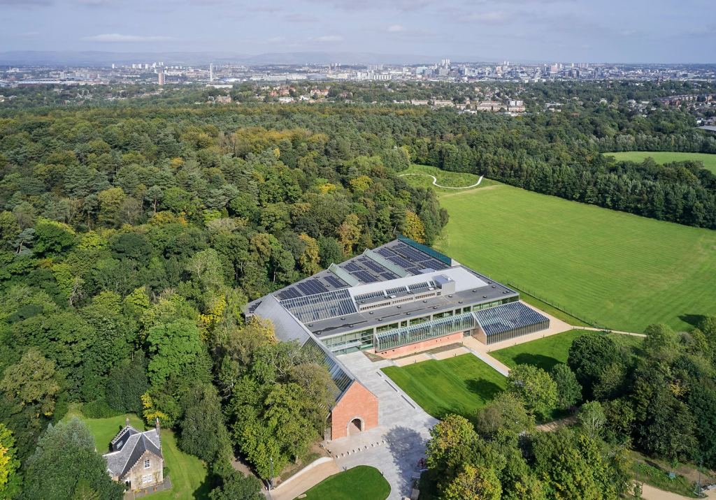
Existing buildings carry many layers of meaning through their physical, social and historical context, and The Burrell is a fine and much loved piece of architecture. Constructed of local red sandstone, polished concrete, stainless steel, timber and glass, it sits in a garden setting designed to allow art and nature to be experienced together.
Our ‘fabric-first’ approach to renewal worked within the existing building’s structure. We looked at what existed and, wherever possible, upgraded it using like-for-like materials to improve the building’s performance without impacting the original aesthetic. Working closely with building services engineer Atelier Ten and façade consultant Arup, we were able to achieve significant carbon footprint reductions.
As an example, the building’s extensive glass was replaced with high-performance glazing that is visually identical, yet provides a far higher thermal rating. The reuse of existing aluminium glazing frames saved over 8.5 tonnes of new aluminium and, in turn, saved 100 tonnes of carbon emissions associated with aluminium production. A bank of solar panels on the roof assists with cutting electricity costs.
The building, nearly half a century old, is largely unchanged and remains true to the original design intent. However, it is vastly more energy efficient, achieving a 50% reduction in heating requirements, and providing a superior environment for the Collection and visitors alike.
Read: May budget to invest $535 million in cultural institutions
2. Use the space for the collection – not storage or administration
Prior to the renewal, a large amount of The Burrell’s space was dedicated to storage and administration. A rethink of internal planning has reclaimed much of this floor area, increasing gallery space by 35% while allowing most of the Collection to stay on-site in accessible storage that assists with rotation.
The administration functions have been moved into town and much of the storage space that remains has been made visible to the public. This innovation in museum design gives visitors the opportunity to see ‘behind the scenes’, adding another layer to the museum experience and gaining additional value from the space.
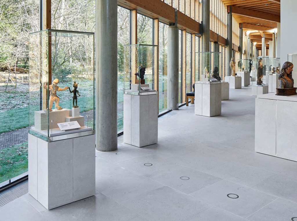
3. Prioritise the collection over the architecture
Museum and gallery design must be mindful to ensure the architecture doesn’t get in the way of the Collection. At The Burrell, the artworks and objects take centre stage.
The original design created a monastic-like setting for displaying the Collection. We have done very little to alter this, making sure that any interventions complement the artworks.
A hallmark of the fitout is the state-of-the-art technology developed to showcase the collection. New plinths, niche cabinets and 200 custom-designed display cases present the eclectic artworks and objects with improved clarity, incorporating internal environmental controls where required. Frameless display cases enhance the view through the gallery itself, while light-sensitive pieces, such as historic tapestries, are displayed using carefully calibrated lighting within the central galleries.
Read: It’s a great building, but…
4. Improve amenity to increase visitation
An iconic narrative in The Burrell’s original 1980s design was the relationship between building, parkland and woodland. Our landscape design team worked alongside our architecture team to respect the original vision while carefully integrating additional elements to increase amenity, improve wayfinding and engage with a new generation of visitors.
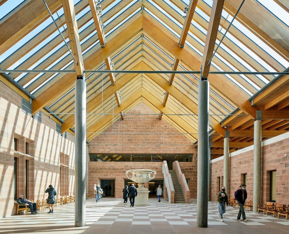
The existing building took visitors on a linear journey. We sensitively opened up areas of the interior to improve horizontal and vertical movement through the galleries, so that more of the collection can be enjoyed in one visit.
A discrete entrance has been added to the east of the important existing entrance, accessed from a new paved piazza that creates an enhanced natural setting where visitors can relax, picnic or spill out from the café at its south-east corner.
Adjoining the entrance sequence, a new central atrium offers multiple entry points to the galleries and better orientation and navigation. The atrium connects all the museum’s levels, from the upper mezzanine galleries, down via terraced seating to the garden level floor below. The latter now accommodates an exhibition and events gallery connected to viewable art storage space, workshops and the rejuvenated café, opening to the parkland beyond.
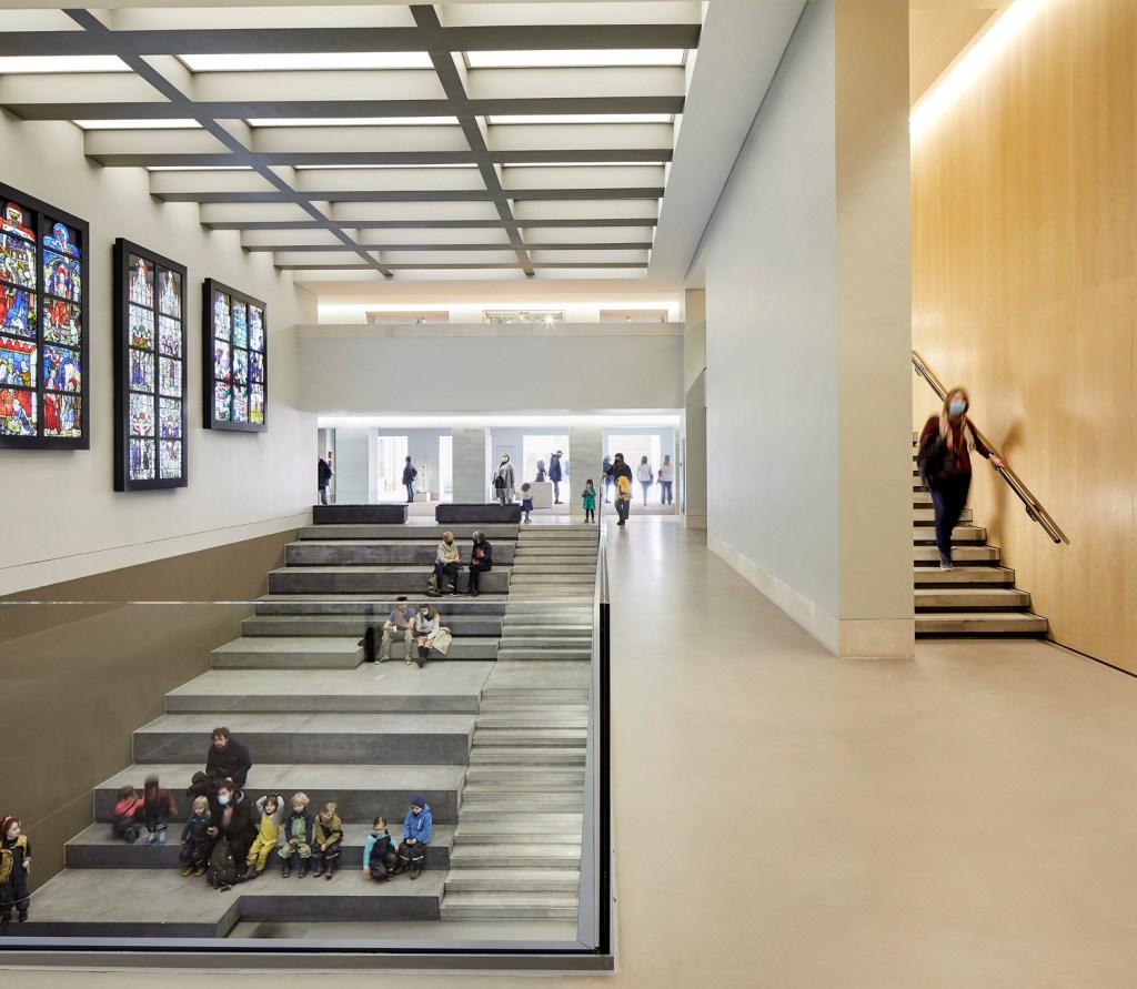
Accessible routes to the museum, a flexible entrance plaza, café terrace and amphitheatre provide a more legible, engaging and diverse user experience that caters to the expectations of contemporary audiences.
The Burrell Collection has received several awards for design and construction since our work was completed, including Heritage and Cultural awards in the Architecture Journal Architecture Awards, one of the world’s most prestigious awards programs. As a case study, it highlights the potential for museums and galleries to greatly improve building performance while enhancing the experience of visitors and staff and, most importantly, allowing collections to truly shine.
The Burrell Collection has a BREEAM (Building Research Establishment’s Environmental Assessment Method) rating of Excellent. BREEAM is the world’s leading science-based suite of validation and certification systems for the sustainable built environment and was established in the UK in 1990.
