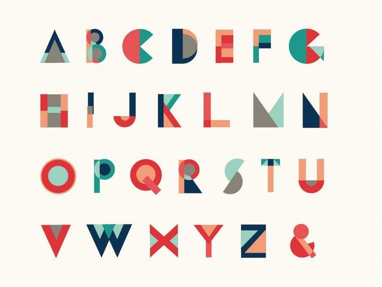
What works for you when it comes to typeface may be entirely different to what works for someone else. Designers have their favourites, while others will make them reel in disgust. We’ve picked out ten safe fonts that will help you with your CV, event advertising and many other business needs.
1. Granjon
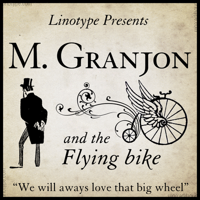
Granjon is so stylish that it’s the font of choice for signage in the Louvre and if it’s good enough to sit beside the Mona Lisa, it’s good enough for us. Sleek, simple and elegant, this font works perfectly if you need to carve your text into granite or emboss onto glass. The typeface was designed by George W. Jones for Linotype & Machinery in 1928. It has also been used in Reader’s Digest since its beginning. The designer based it on Claude Garamond’s late Texte (16 point) roman model, which brings us to our next font.
2. Garamond
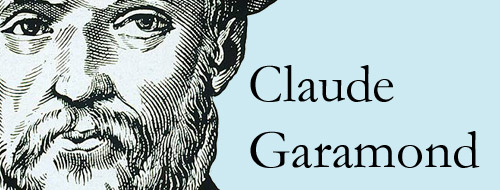
Still on the serif fonts, Garamond is widely considered as one of the most legible serif typefaces there is. Designed by Claude Garamond and first used in the book Paraphrasis in Elegantiarum Libros Laurentii Vallae published in 1530, it is also one of the oldest fonts. Having stood the test of time, it is still widely used today. It has also been in the news recently, with a middle schooler claiming it could save the US government $400 million in printing costs. While this theory was later debunked, this font still packs a punch.
3. Proxima Nova
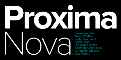
People are going crazy for Proxima Nova. John Giardiniere from popular type website Font Squirrel told ArtsHub, ‘There’s no more popular font these days than Proxima Nova, and for good reason. Websites just look awesome in it.‘
Basically, if you are publishing online, you can’t go past a strong font like Proxima Nova, which is a reworking of Proxima Sans (1994). Sitting between typefaces like Futura and Akzidenz Grotesk, its geometric appearance is readable and cutting edge.
4. Trump Gothic Pro
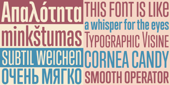
Want an excellent looking business card? Then you can’t go past Trump Gothic Pro. ‘Rough/ distressed looking display fonts are a big fad right now, so is condensed allcaps sans serif fonts used for titles, like Bebas or Trump Gothic,’ says Giardiniere.
If it looks familiar to you it’s probably because of its use across movie credits, posters and magazine covers. It evolved from Georg Trump’s 1955 Signum typeface and became available to the public in 2005.
5. Source Sans Pro
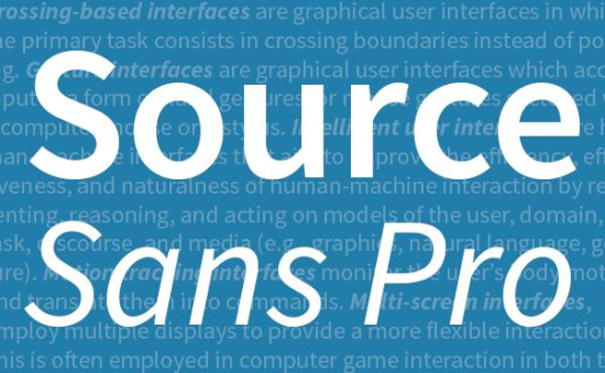
Designed by Paul D Hunt as Adobe’s first open source typeface, you might see Source Sans Pro floating around popular user interfaces. It’s good for small words, and has a bigger width than some other similar gothics. But it’s versatile, and its shorter majuscule letters make it easy to read in longer passages as well. It’s a great Sans Serif font.
‘If we’re talking Free Fonts, Source Sans Pro is at the top of our front page for a reason. It’s an incredible versatile font and definitely worth the price of Free!’, says Giardiniere.
6. Times New Roman
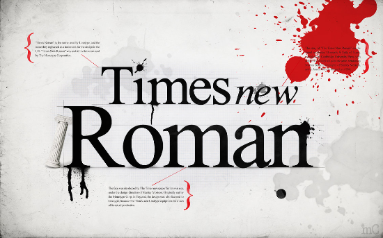
When recruiters and employers are sifting through hundreds of CVs looking for the perfect candidate they don’t want to be hit by a fancy font that is difficult to read. Sure you may stand out, but an over the top font could mean that you are skipped over because your important facts are illegible. Stick to a simple, easy to read serif font like Times New Roman and your CV will not only look professional, but its information will stand out. Keep it around 10-12 for point size. Hey, it may seem boring, but sometimes simple is best.
7. Bebas Nue
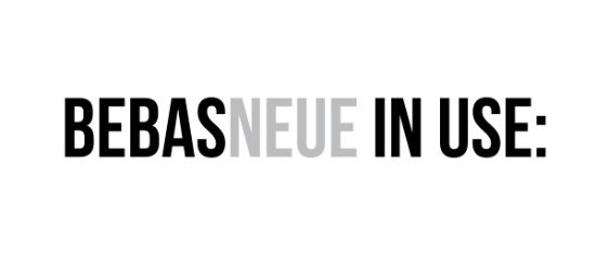
If you want an eye-catching poster for your business and you want to grab the viewer without shouting at them, then this somewhat gentler all caps font is the way to go. This sans serif font is based on the original by Ryoichi Tsunekawa. This clean, elegant font is great not only for web, but for advertising your events in print brochures and posters.
8. Not Comic Sans or Papyrus
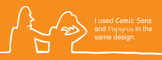
‘A good designer can make just about every font work, but most fonts included on your OS are overused. And this goes without saying, but never comic sans or papyrus,’ says Giardiniere.
It’s true, unless you want to look like a badly designed childcare pamphlet or a seedy massage parlour it’s best to stay away from these two. There is even a website set up for Comic Sans criminals.
9. Gill Sans
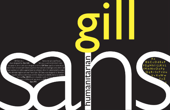
Anyone who has been to the United Kingdom will recognise this iconic typeface. It is used on London Underground signs, by the BBC and also on Penguin classics so there is no denying its versatility. You should use it for signage or business logos.
10. Chaparral Pro
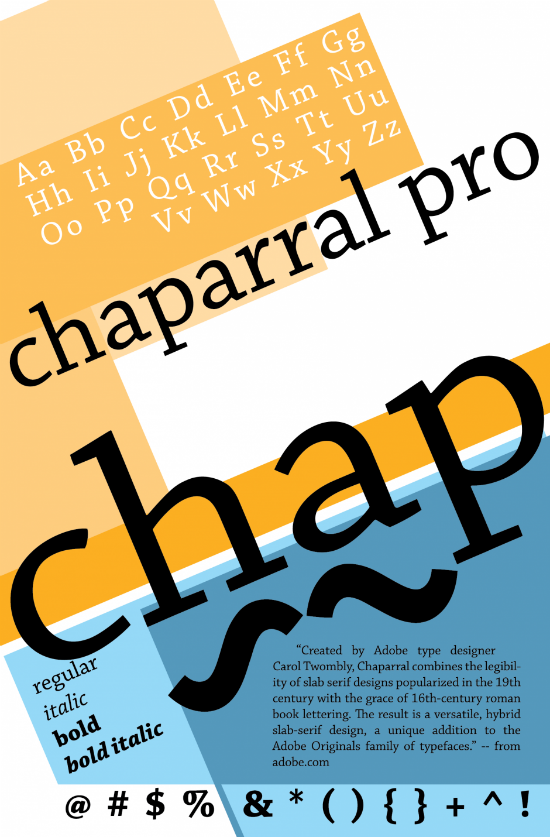
This type has a bit of a Mad Man feel to it, and is designed by Adobe type designer Carol Twombly. It’s a nice hybrid slab-serif, which strays away from the geometric slab serif designs. Its varied letter proportions make it a bit unique, but not so outlandish that it is unreadable.
